Lipstick Swatch Guide: Finding Your Perfect Shade Match
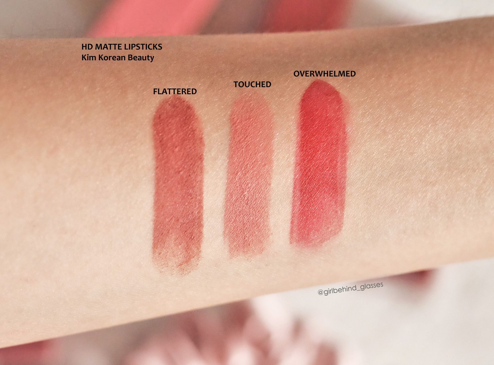
464 views
You know the feeling. The lipstick looked gorgeous in the tube, beautiful under the store lights, and somehow... wrong on your lips.
Too orange. Too gray. Too pale. That expensive nude that looked effortless on someone else suddenly makes your face look tired.
The problem usually isn't that the lipstick is "bad." Your lips, skin tone, undertone, lighting, and even the formula are changing what you see. A proper lipstick swatch can cut through most of that guesswork.
Start with the part people often confuse: tone vs. undertone
Your skin tone is the visible depth of your complexion—fair, light, medium, tan, deep, and everything between. It can shift somewhat with sun exposure or tanning.
Your undertone is the subtle hue underneath. The common categories are warm, cool, and neutral. Unlike surface tone, undertone is generally treated as relatively consistent.
That's why two people with similar skin depth can look completely different wearing the same lipstick.
A warm undertone often has yellow, golden, peach, or olive characteristics. Cool undertones can appear pink, rosy, bluish, or red. Neutral sits somewhere between the two.
Don't obsess over putting yourself into a perfect box, though. Real complexions aren't paint samples.
Three quick undertone tests
Try these in natural daylight, rather than relying on the warm lighting commonly used in makeup stores.
Veins: Greenish-looking veins can suggest warm undertones; blue or purple-looking veins can suggest cool. A mixture may indicate neutral.
Jewelry: If gold consistently looks more harmonious, you may lean warm. If silver looks better, you may lean cool.
White versus cream: Hold a clean white fabric beside your bare face, then compare it with cream or ivory. If cream makes your complexion look healthier, warm undertones may be present; if crisp white looks better, you may lean cool.
Still unsure? That's fine. Neutral undertones are particularly forgiving, and you can often wear both warm and cool lipstick families successfully.
The swatch itself matters more than the tube
A lipstick bullet can be misleading.
The color you see in the tube is concentrated pigment sitting on an opaque surface. Your lips are translucent, textured, naturally pigmented, and slightly different in color from the skin around them. Put the lipstick on, and the result changes.
That's why a good swatch should answer three questions:
What does the color actually look like?
What undertone does it reveal on me?
How does the formula change the appearance?
For the most useful comparison, apply several shades next to each other rather than testing one, wiping it away, and trying to remember what it looked like.
Here's how to swatch lipstick properly
If you're shopping in a store, don't rush this part.
First, make sure your lips aren't covered in another strong lipstick, tinted balm, or gloss. Those products can interfere with the color you're trying to evaluate.
Then apply a reasonably opaque stripe of each candidate shade. Keep the swatches separated so their colors don't visually blend.
For online purchases, there's an extra problem: a digital color isn't guaranteed to reproduce the actual lipstick. Screen brightness, display calibration, photography, studio lighting, and image processing can all affect what you see.
Natural daylight is your referee.
L'Oréal Paris also recommends natural daylight when evaluating undertones because store lighting can distort how colors appear.
If possible, check the swatch near a window and again in the type of lighting where you'll actually wear the lipstick. A nude that looks perfect at noon may suddenly pull orange under warm indoor bulbs.
Don't judge the first swipe too quickly
Some formulas change dramatically after they set.
A glossy lipstick can appear more translucent than expected. A matte liquid lipstick may deepen as it dries. A sheer balm can allow your natural lip color to dominate the final result.
Give the product a few minutes.
Then look again.
That's often where the real shade appears.
Match lipstick by undertone, not just skin depth
Once you know your undertone, choosing a starting point becomes much easier.
Undertone | Lipstick families worth testing |
|---|---|
Warm | Coral, peach, terracotta, orange-red, brick, warm brown |
Cool | Blue-red, berry, mauve, plum, rosy pink |
Neutral | Warm and cool families; balanced reds and adaptable pinks |
These aren't hard rules. They're starting points.
Maybelline recommends warm-toned coral, orange, red, and pink shades for warm undertones, while cool undertones can work particularly well with blue-based pinks, purples, and berries. Neutral undertones have considerably more flexibility.
Sephora similarly highlights cherry or blue-based reds, berries, and mauves for cool undertones, while suggesting that cool undertones may want to avoid strongly yellow or orange-based lip colors.
But here's the fun part: you don't have to obey the chart.
If you love orange lipstick and have cool undertones, wear orange. You may simply prefer an orange with a little more red or pink in it instead of an extremely yellow-orange shade.
Finding the right nude is a different game
Nude lipstick causes more failed purchases than almost anything else.
Why?
Because "nude" doesn't mean beige.
Your ideal nude usually needs enough depth and color to work with your natural lip pigmentation. A shade that's significantly lighter than your lips can erase the natural definition around your mouth and leave you looking washed out.
For nude-pink shades, L'Oréal Paris recommends staying relatively close to your natural lip color rather than choosing an excessively pale pink.
Try this simple approach:
Look at your natural lips without makeup.
Identify whether they lean pink, mauve, brown, peach, or rose.
Choose a lipstick one or two steps around that family.
Adjust the undertone rather than automatically choosing a lighter shade.
For example, someone with naturally rosy lips may find a muted rose nude far more flattering than a pale beige. Someone with naturally brown-pigmented lips might need a caramel, warm rose, or deeper nude to achieve the same "barely there" effect.
The best nude often looks boring in the tube.
Then you put it on—and suddenly it makes sense.
Red lipstick: find the direction, not one universal "perfect red"
Red lipstick doesn't belong to one undertone.
There are blue-reds, orange-reds, brick reds, berry reds, neutral reds, and deeper wine-leaning reds. That's why saying "red lipstick suits everyone" is only half the story.
For cool undertones, start by swatching cherry, blue-red, raspberry, and berry reds.
Warm undertones can explore tomato, coral-red, brick, and orange-red shades.
Neutral undertones have the luxury of testing both sides.
L'Oréal Paris' current red-lip guidance also emphasizes that both skin tone and undertone affect the result, while neutral reds can provide a particularly versatile middle ground.
And don't automatically reject a red because the first application looks too strong. A thin layer patted onto the lips can produce an entirely different effect from a fully opaque application.
Your natural lip color is part of the formula
This is one of the biggest reasons online shade matching goes wrong.
Imagine two people applying the same sheer berry lipstick. Person A has naturally pale pink lips. Person B has naturally deeper brown pigmentation.
They aren't going to get the same berry.
The lipstick is interacting with the color underneath it.
That's why swatches from people with different complexions can be useful for reference, but they shouldn't be treated as an exact prediction of what you'll get.
A particularly useful comparison is to find swatches from someone with similar skin depth and similar natural lip pigmentation, not simply someone who looks vaguely similar in a product photograph.
Finish can change the shade you think you're buying
Two lipsticks can contain very similar pigments and still look different because of finish.
A glossy formula reflects more light, making a shade appear brighter or more translucent. Satin formulas generally give you more color while retaining some visual softness. Matte formulas absorb more light and can make the same color appear flatter, deeper, or more intense.
Formula also changes how texture shows.
Dry, flaky lips can make matte lipstick look uneven. L'Oréal Paris recommends preparing the lips before lipstick application, particularly when aiming for a smooth finish.
So don't swatch only for color. Swatch for finish + texture + wear.
A beautiful shade isn't much help if you dislike the way the formula feels after two hours.
A practical five-shade swatch test
If you're standing in a makeup aisle and can't decide, narrow your choices to five:
Your obvious favorite — the shade you instinctively picked.
A warmer version — useful for discovering whether warmth improves the match.
A cooler version — gives you the opposite comparison.
A slightly deeper shade — helps determine whether the original is too pale.
A neutral shade — your control sample.
Apply them side by side.
Wait.
Look at them in daylight.
Then check your whole face rather than staring exclusively at your lips. The right lipstick often makes the complexion look more balanced, while the wrong undertone can make the face appear dull, overly red, gray, or yellow.
MAC's current shade-matching approach similarly separates undertone, shade depth, finish, and formula rather than treating shade selection as a single-color decision.
That distinction is useful beyond foundation. Lipstick matching benefits from the same basic discipline.
What if the "wrong" shade is actually close?
Don't throw it away yet.
A lipstick that's slightly too cool can sometimes be warmed with a warmer lip liner. A nude that's too pale can become much more wearable when layered over a deeper liner or paired with a stronger eye look.
You can also change intensity.
Apply lipstick directly for maximum pigment. Tap it on with a fingertip for a softer stain-like effect. Add gloss to increase reflectivity and make a matte-looking shade feel visually lighter.
That's why finding your perfect shade isn't necessarily about discovering one magical tube.
Sometimes it's about discovering the right color family and learning how to control it.
A note about lipstick safety
Shade matching is the fun part, but product quality still matters.
In the United States, lipstick is regulated as a cosmetic. Most cosmetics and cosmetic ingredients don't require FDA premarket approval, although color additives used in cosmetics must meet applicable FDA requirements and be approved for their intended use. Manufacturers are responsible for ensuring their products are safe under customary or labeled use.
It's also worth buying from reputable sellers and checking product packaging rather than relying solely on a marketplace listing.
If a lipstick repeatedly causes itching, burning, swelling, or a rash around your lips, stop using it rather than trying to "get used to" the product. The American Academy of Dermatology notes that lipstick, lip balm, and lip gloss can trigger contact dermatitis, and identifying the offending product may require removing products and reintroducing them systematically.
Lipstick swatch FAQs
Should I swatch lipstick on my hand or my lips?
Your lips give the most useful final-color information because their natural pigmentation affects the result. If you're testing products in person, however, follow the retailer's hygiene rules and don't apply communal testers directly to your lips unless the store provides a hygienic method.
Why does the same lipstick look different on different people?
Natural lip pigmentation, skin undertone, skin depth, application thickness, and formula all affect the finished color. A sheer lipstick is especially dependent on what's underneath it.
How do I choose lipstick for olive undertones?
Start by testing neutral and warm shades, particularly muted rose, terracotta, caramel, brick, and certain warm pinks. Then compare them directly in daylight. Olive complexions can be tricky because they may contain both yellow/golden and greenish qualities, so a simple warm-versus-cool test isn't always enough.
Why does my nude lipstick make me look washed out?
It's probably too light, too beige, or mismatched to your undertone. Try a nude closer to your natural lip depth, then compare a rosy, caramel, peach, or mauve version depending on your coloring. Lighter isn't automatically more natural.
Is there one lipstick shade that works for everyone?
There isn't one universally perfect shade. A balanced neutral red is often versatile, but the final result still depends on natural lip color, undertone, skin depth, formula, and how heavily you apply it.
The easiest way to stop wasting money on lipstick
Next time you're tempted by a shade, don't buy it because the tube looks perfect.
Swatch it.
Compare it with something warmer, something cooler, and something slightly deeper. Check it in daylight. Let the formula settle. Look at your entire face.
Then ask one simple question: does this color make my complexion look better, or am I only admiring the lipstick itself?
That little distinction can save a surprising number of disappointing purchases—and once you identify your favorite undertone, depth, and finish, future shade hunting gets dramatically easier.
lipstick swatch guide
perfect lipstick shade
lipstick for skin tone
lipstick shade match
lipstick swatches
best lipstick colors
makeup tips
nude lipstick guide
lipstick selection
beauty guide
Found this helpful? Share it!